BMO Secondary Color Palette
My role: Project Lead, Lead Designer
Project type: Brand design
Year: 2025
Company: BMO Bank - US & Canada
The Problem
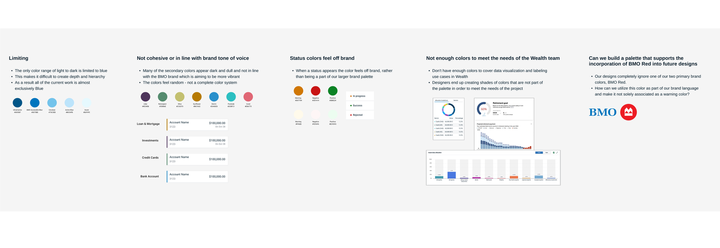
BMO’s existing secondary palette was limited, incohesive and not representing the brands tone of voice. This left most of their work looking very blue heavy and lacking distinction. Their status notifications appeared in seemingly random hues that clashed with their primary brand colors and they needed to address the issue of designers creating their own colors to meet the needs of the charts and labels used by the Wealth team.
Goals & requirements
Improve and expand BMO’s secondary palette to better match their digital needs across platforms
A minimum of 15 possible colors to be used for infographics and charts
8 distinct hues that can be used to distinguish the different lines of business
Can be used to convey identification or meaning in small components within the UI such as status indicators
A palette that allows for flexibility while meeting accessibility requirements in its applications
A palette that compliments the two Primary brand colors (BMO Blue and BMO Red), brings in warmth and vibrancy, and allows BMO Red to be included in our color applications outside of being used as a warning indicator
A palette that will align with the goals of the bank to be a top competitor in the U.S. market
Opportunity
Building a color palette that applies successfully in Dark Mode as well