
Exponential sales growth through digital banking redesign
My role: Design Lead
Project: Digital banking redesign
Year: 2024
Company: BMO Bank, US
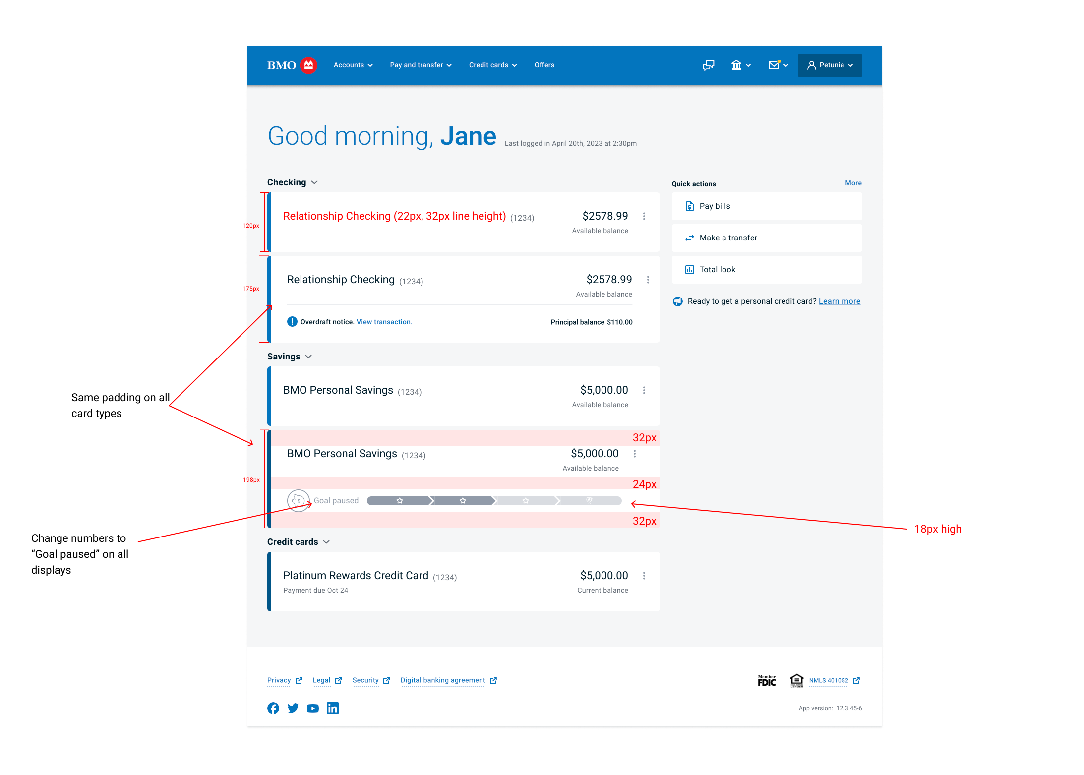
The Footnotes:
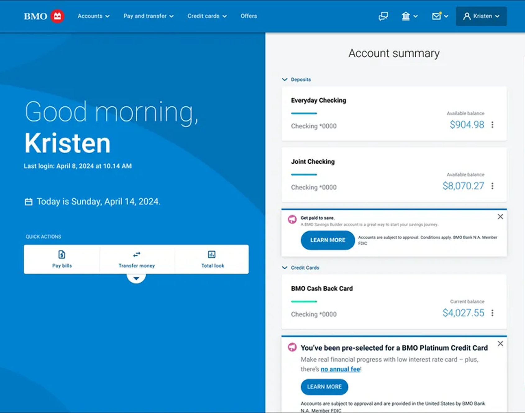
BMO’s existing online banking featured a 50/50 split screen, with an oversized greeting taking up the entire left side of the screen and relevant content on the right side - this was the layout for every page in their online banking experience. Because of this inefficient use of space, when it came to the “accounts summary” page, promotional offers and ads were staggered in between account cards resulting in a confusing and incohesive user experience. Additionally, BMO had massive sales goals on the horizon following their acquisition of Bank of the West. The current design was too limiting and needed to be modernized while providing more flexibility for additional sales points.
PROBLEM
PROCESS
Discover…. Component audit | Competitive analysis | User interviews
Define… UI requirements | Feature prioritization | Visual direction
Ideate… Inspiration | Wireframes | Partner feedback | Refine | Prototype
Implement… Design system | Socialize | Production | QA | Response study
SOLUTION
A dashboard-like “Accounts” page with strong hierarchy, intuitive UX/UI, and plenty of flexible space for future features and cross-sell opportunities such as customer insights, special offers and more.
VERIFIED RESULTS
Our final design provided a multitude of options for future features and offers while improving clarity, modernizing the look, reducing clicks, and greatly improving the sales funnel.
We received over 94% positive customer feedback on the new layout (which is very rare when releasing a new design)
Digital banking favorability improved 30% year-over-year
We increased our sales funnel by +75% through the new entry points
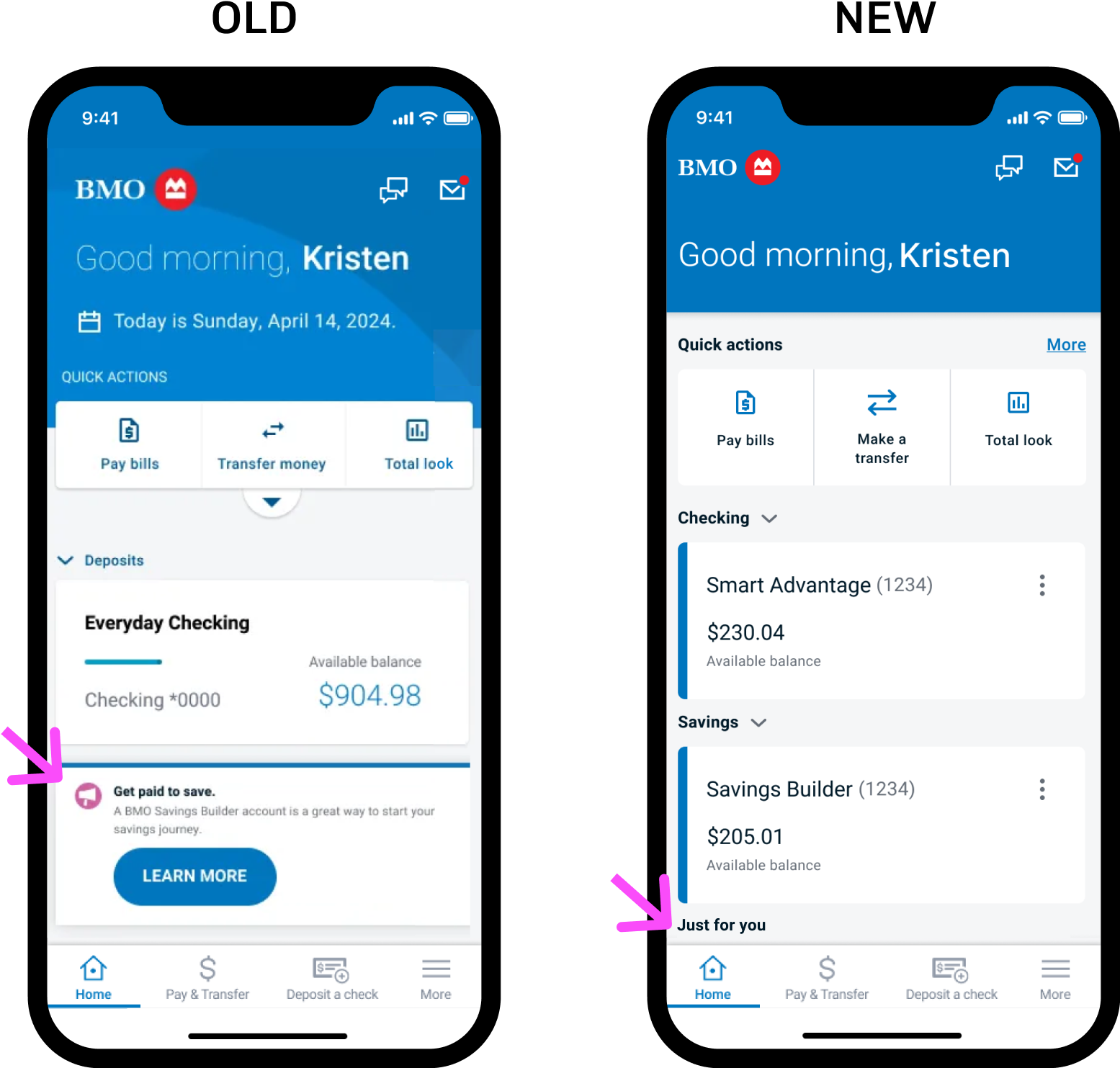
The old layout featuring a 50/50 split screen on desktop and ads awkwardly placed between account cards.

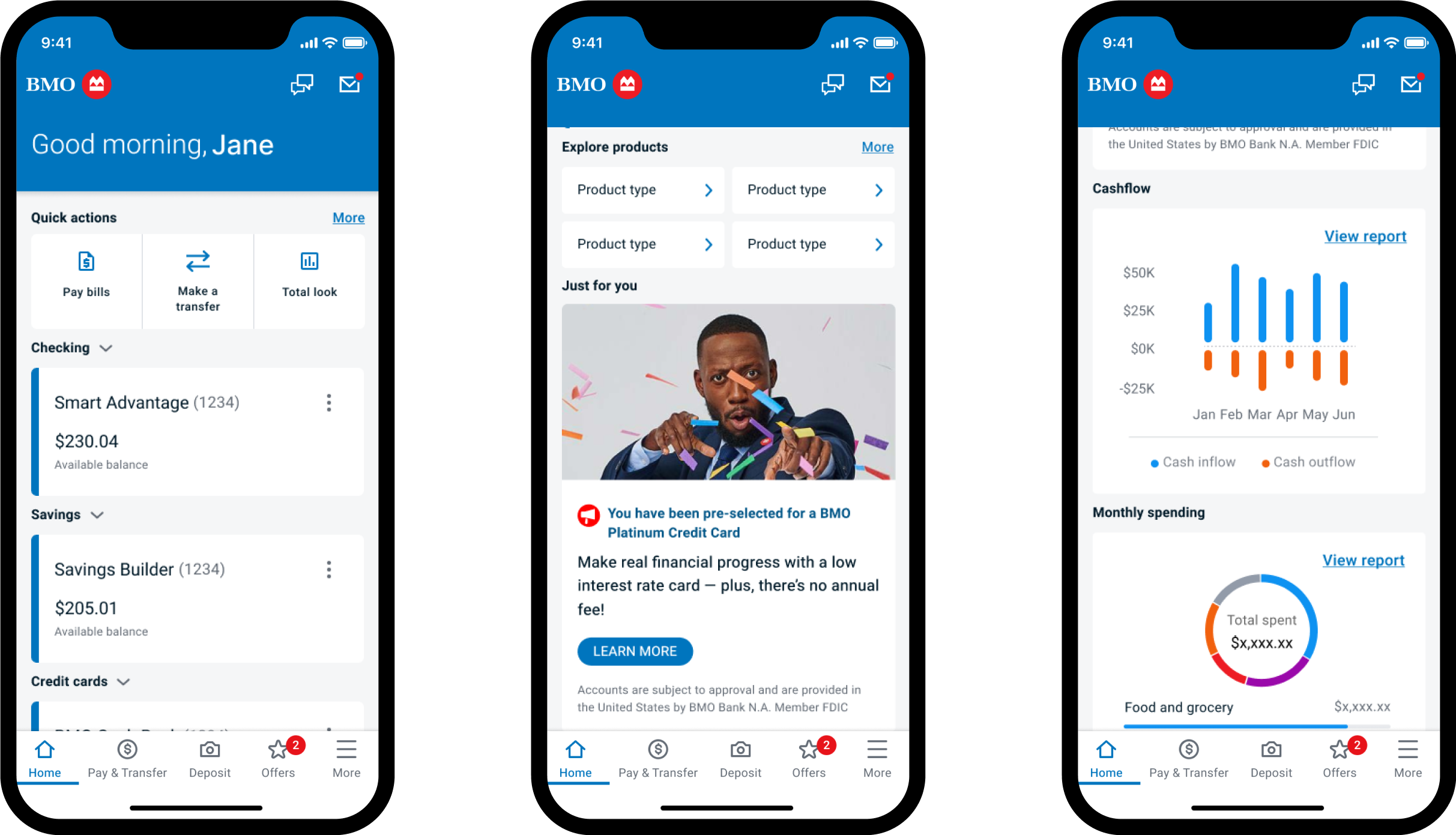
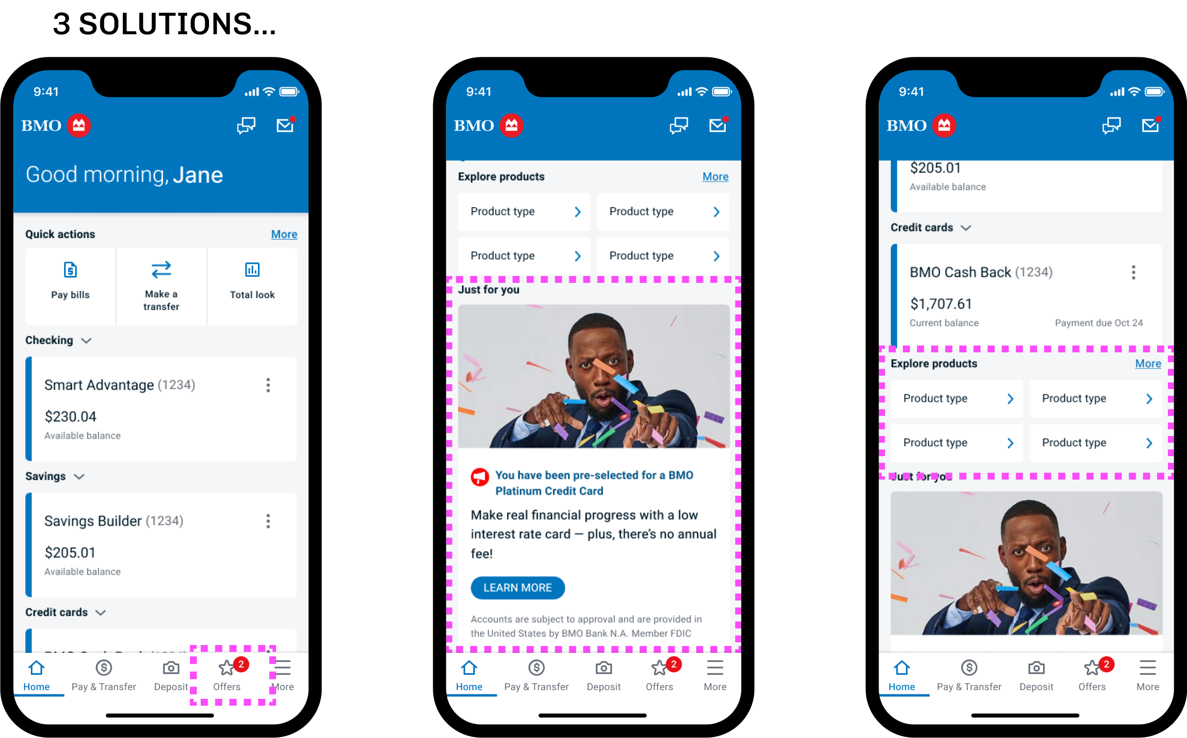
THE FINAL DESIGN featuring a modernized layout with 3 new entry points for customers to explore new offers and products and plenty of room for future ads and features


PROJECT GOAL
To modernize and redesign the U.S. Account summary page to function more like a dashboard, providing room for cross-sell opportunities and future features to increase the sales funnel, and in doing so, help BMO stand out amongst it’s U.S. competitors as a premium bank.
REQUIREMENTS & CONSIDERATIONS
Maintain an element of similarity from the existing look and feel, so as not to feel too unfamiliar to customers, while also lightly referencing the Canadian online banking pages.
The visual style of interactions can change but not their functionality.
Icons, buttons and other global elements are out of scope.
Case study Overview
(Contact for full case study presentation)
Competitive analysis revealed a 70/30 layout was most common and provided a lot of flexibility.

A kickoff was held to gain alignment across teams and share ideation

Moderated studies revealed how customers ranked the importance of different features

A new offers tab, newly designed ads, and new entry points allowed us to significantly increase the sales funnel even though offers were moving “below the fold” on mobile
Refinement

RESULTS
Our final design provided a multitude of options for future features and offers while improving clarity, modernizing the look, reducing clicks, and greatly improving the sales funnel.
We received over 94% positive customer feedback on the new layout (which is very rare when releasing a new design)
Digital banking favorability improved 30% year-over-year
We increased our sales funnel by 75% through the new entry points
