
Transforming financial tools for a competitive landscape
My role: Design Lead
Project: Digital banking redesign
Year: 2024
Company: BMO Bank, US
PROBLEM
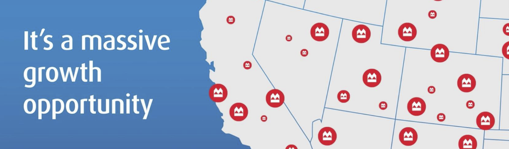
BMO’s digital banking design featured a 50/50 split screen, with a greeting on the left and relevant content on the right - this was the page style for every page in their online banking experience! While a friendly greeting is nice, it was not an efficient use of space. With massive sales goals on the bank’s roadmap this layout did not allow flexibility for value-add and cross-sell opportunities. The 50/50 design also did not visually align with BMO’s new marketing campaigns used to heavily canvas the US market in their goal to fight for the position of #3 bank in the U.S. The 50/50 had to go.
PROCESS
Discover…. Component audit | Competitive analysis | User interviews
Define… UI requirements | Feature prioritization | Visual direction
Ideate… Inspiration | Wireframes | Partner feedback | Refine | Prototype
Implement… Design system | Socialize | Production | QA | Response study
SOLUTION
A dashboard-like “Accounts” page with strong hierarchy, lots of padding for ease of comprehension, and plenty of flexible space for future features and cross-sell opportunities such as customer insights, special offers and more.
RESULT
This solution received over 90% positive customer feedback in post-production surveys!

Case study
Project goal
To modernize the U.S. Account summary page for more efficient use of space, to function more like a dashboard, with room for future value-add, cross-sell opportunities to help BMO stand out amongst it’s U.S. competitors as a premium bank.
Requirements and considerations
Maintain an element of similarity from the existing look and feel, so as not to feel too unfamiliar to customers, while also lightly referencing the Canadian online banking pages.
The visual style of interactions can change but not their functionality.
Icons, buttons and other global elements are out of scope.
Competitive analysis

Kick-off and blue sky thinking

Research
We decided it would be helpful to user test some wireframes to find out what elements of the Account Summary page were most important to customers, how prominent they should be, and what elements might be better off removed altogether.
For example, we wanted to explore whether or not customers would find it useful or distracting to see a truncated transaction list on the Account Summary page, rather than having to click in to the Account Details page to view their most recent transactions. Out of the 6 individuals we interviewed, most found this more confusing than helpful so we did not move forward with that element. However, we discovered that the majority of our users felt the “Savings Goal” feature was very valuable to have on the Account Summary page, so we kept it included, much to the “Savings Goal” product manager’s delight.

Design, content, share, revise
With our research findings in hand, I worked closely with my content partner and our product partners to hone in the final designs. There were so many parts to this page that needed to be considered and decided upon, such as: card styles, quick actions, and various different alerts for each account type, like overdraft notices or late payment warnings.

Final product
Our final design utilized a 70/30 layout and long, rectangular account cards creating lots of space for cross-sell opportunities in the right panel or above or below the accounts as well as creating more breathing room so future elements would not overwhelm the page. We slightly rounded the corners on the cards and removed the drop shadows to help modernize the look creating a cleaner style.
Results
After going live we had over 90% positive feedback from customers engaging with the new design.
Nearly zero negative reviews received across multiple surveys!

Final design
-
![]()
Desktop
-
![]()
Mobile & Tablet


More to come
This was just phase one! So much more to do to bring the rest of online banking to this current style and finalizing our strategy and designs for the newly created value-add opportunities and bringing in more diversity of color!
