Reimagining brand color: An accessible color system & dark mode implementation
My role: Design Lead
Project: New color palette & dark mode
Year: 2025
Company: BMO Bank
PROBLEM
BMO’s existing secondary color palette was limited, incohesive and not representative of the brand’s tone of voice. Most of their palette relied heavily on blues, which often resulted in a washed out look, lacking distinction and hierarchy. Their status notification colors seemed random and clashed with their primary brand colors. Lastly, they needed to address the issue of designers creating their own colors to meet their needs when designing for charts and graphs with large data sets.
PROCESS
Discover… Research: How exactly does one build a scalable palette from scratch? | Competitive analysis: How have others approached this?
Scope… Define approach | This needs to solve for use cases across the company | Accessibility needs: it must suit the goal of AA accessibility ratings | Must include dark mode
Build… Hue adjusted color ranges, using a loose pattern, fine tuned by eye, with the two primary brand colors of BMO Red and BMO Blue as the foundation
Test… Does this solve for the use cases needed? | Design teams stress test
Define… Create brand guidelines for color applications
Share… Bring in stakeholders, leadership, and Brand for buy-in and approval
Ship… Update components and design library, socialize and apply to designs, new and existing!
SOLUTION
A complete and scalable color system to compliment the existing primary brand colors and maintain the brand’s tone of voice in every application. This palette meets the wide variety of color needs across the organization, allows flexibility in design while adhering to accessibility standards and includes dark mode applications.
RESULT
A beautiful palette of 64 distinct hues to compliment and deepen the brand.
The palette was approved by the Brand team with flying colors and the larger design organization is thrilled to have horizons widened in their design landscape!

Case study
Project goal
To build a scalable, flexible, and accessible color spectrum to be applied as part of a total color system to the brand as the secondary color palette - to enliven and deepen branding and better meet the needs across lines of business.
Requirements and considerations
The palette must be vetted for AA accessibility for text, graphics, links, buttons - anything actionable or conveying information
A minimum of 15 possible colors to be used for infographics and charts
8 distinct hues that can be used to distinguish the different lines of business
Can be used to convey identification or meaning in small components within the UI such as status indicators
Needs to compliment the two Primary brand colors (BMO Blue and BMO Red), brings in warmth and vibrancy
A palette that will align with the goals of the bank to be a top competitor in the U.S. market
Opportunity
Design the palette to be applied to a future-state dark mode as well.

Competitive analysis and method
Exactly how do you build a secondary palette from scratch, without using an algorithm…?

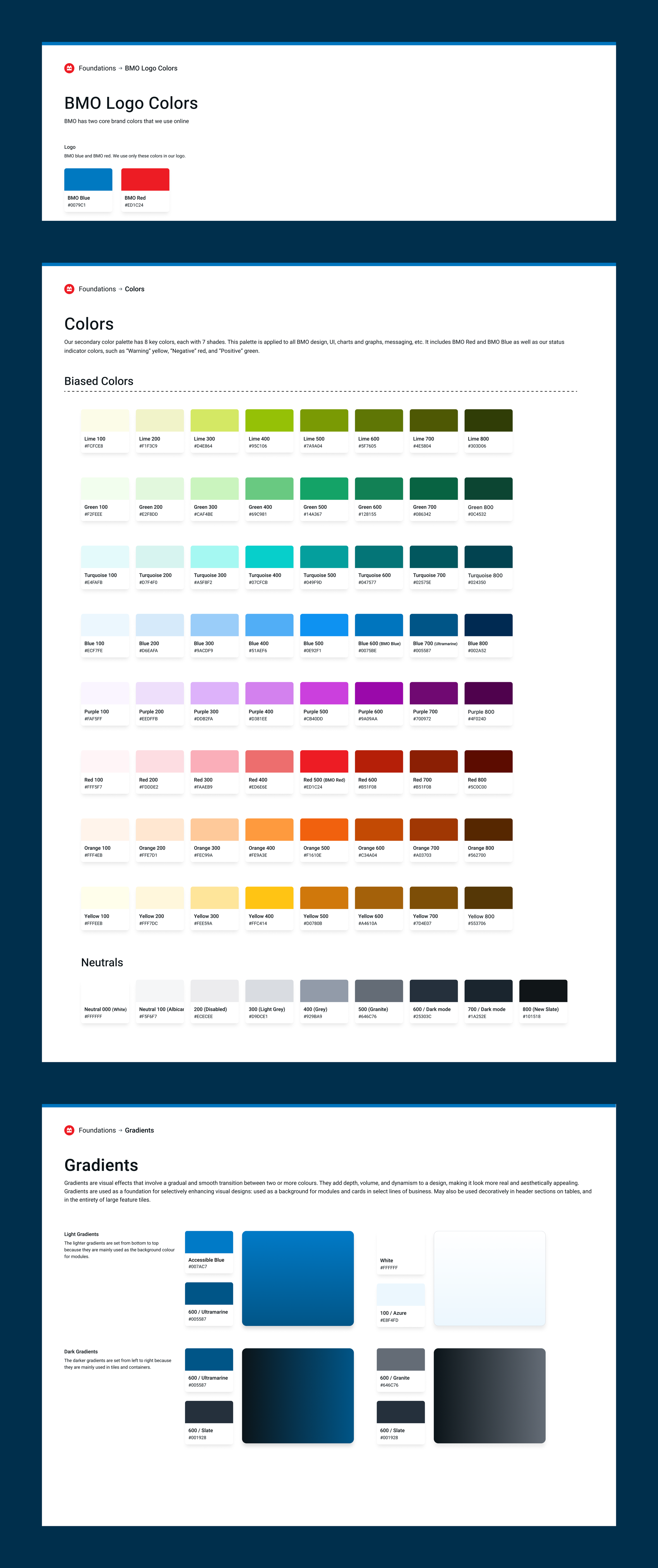
Hue adjusted colors using HSL
Similar to the methods used by Stripe and Atlassian, I used the HSL scale (Hue, Saturation, Lightness) to create a palette of 8 distinct colors and their range of shades from light to dark.

Leveraging Figma’s Variables
Variables allowed us to apply colors across designs, create rules for these colors, and toggle designs between light and dark mode.

Vetting for accessibility across use cases
BMO is aiming for an AA rating for accessibility. I created a legend for designers to use to ensure their color choices would result in accessible designs.
We consulted weekly with an outside accessibility consulting team, and hosted live user testing with visually impaired users, as they live tested our pages in dark mode and navigated our site using a screen reader. This was very eye opening and we learned so much!

Assigning meaning and creating brand guidelines
Unlike their previous status colors which were separate and incongruent with the rest of the brand colors, the new status colors would be pulled directly from the palette so they remained within the visual language.
We began building brand guidelines for the many varied applications to make sure each use case would be supported by the palette.

Charts & graphs
We defined rules around applying color to charts and graphs to ensure they met the accessibility rating and that designers could create successful and attractive visual applications. This was complex!


Applying the palette across lines of business and winning over Brand
To ensure we were considering the needs of the wider teams and gaining buy-in along the way we presented to three separate groups: design ambassadors from each line of business, BMO US and Canadian design leadership, BMO Brand team. We applied the palette to pages from each line of business and allowed the teams to interact with the designs and leave comments or questions.